


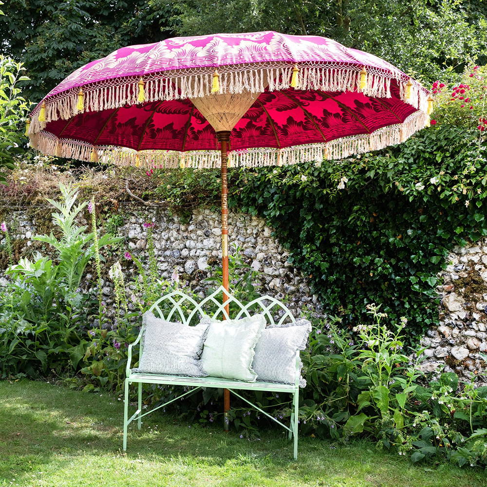
HOW TO STYLE YOUR PARASOL
"Nature never makes a mistake, and boldly combines maroon, tawny, raspberry, violet with shades of marigold, orange, green and primrose yellow. I’ve enjoyed bringing together these sometimes surprising colours to create harmonious designs."
COOL TONES


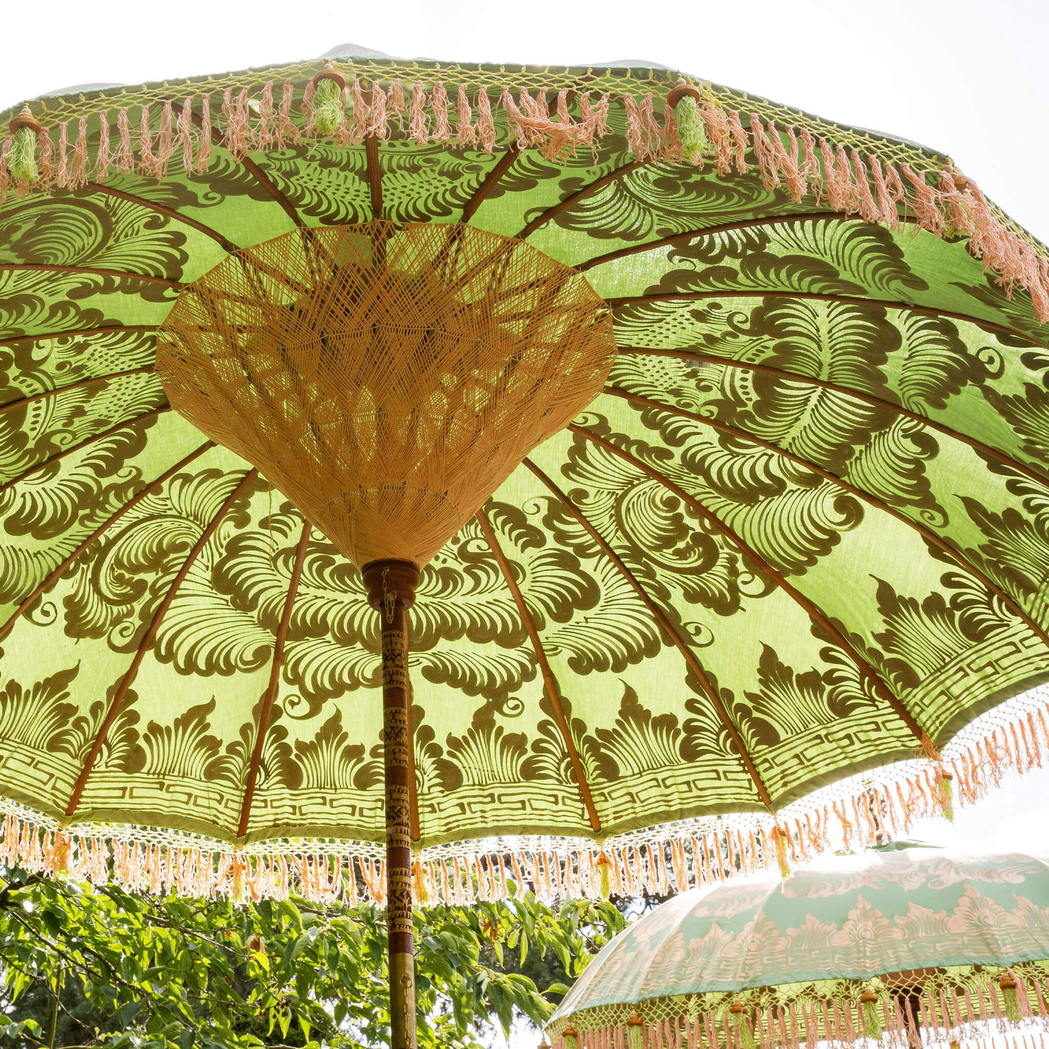

"This year I’ve found myself drawn towards opulent purples & delicate green tones"
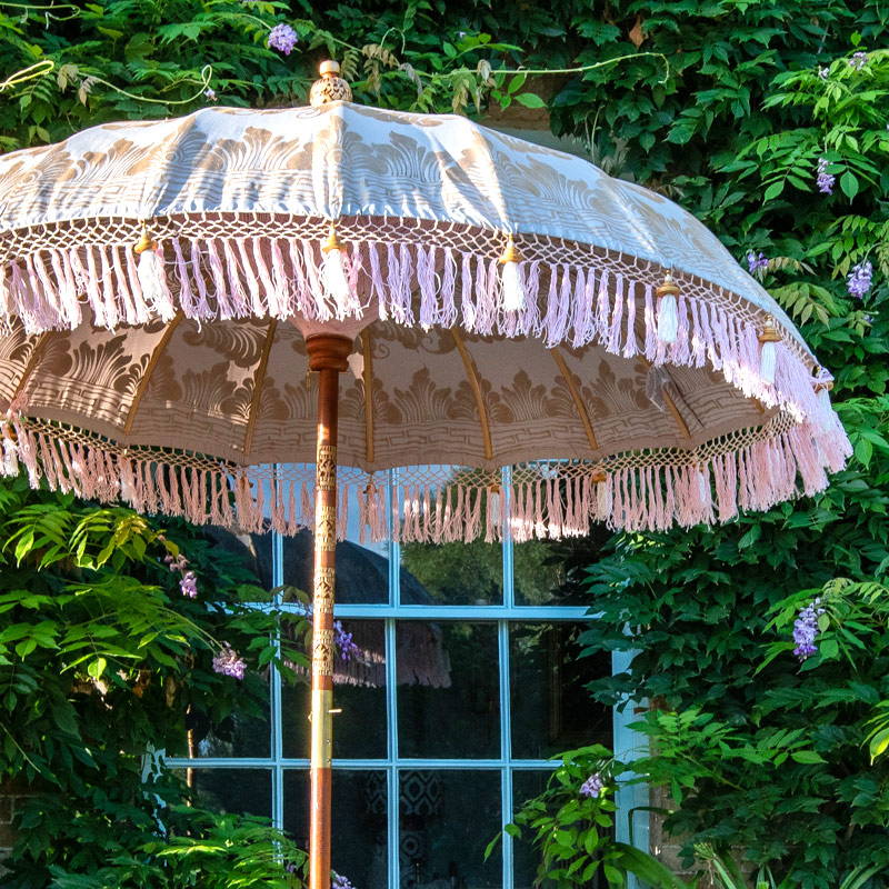
Blue and green shades are remarkable together and create a surprising and chic aesthetic, greens and bright blues mute each other. These are brilliant combined with both bright colours and pastel shades. The glory of these lovely hues is that they also work well with patterns and neutral settings. Adding some blue or green to a dark or light colour theme is a very elegant way to introduce colour, they’re a stylish and safe option in the best way.
If you have a smaller garden or lots of foliage then a cool toned parasol will blend with the natural colours, and can make your space look larger, or they can contrast beautifully against red brick. Dark tones look fabulous against pretty much any backdrop. Our darker blue and green parasols have lighter interiors so sitting underneath them feels expansive.
WARMER SHADES


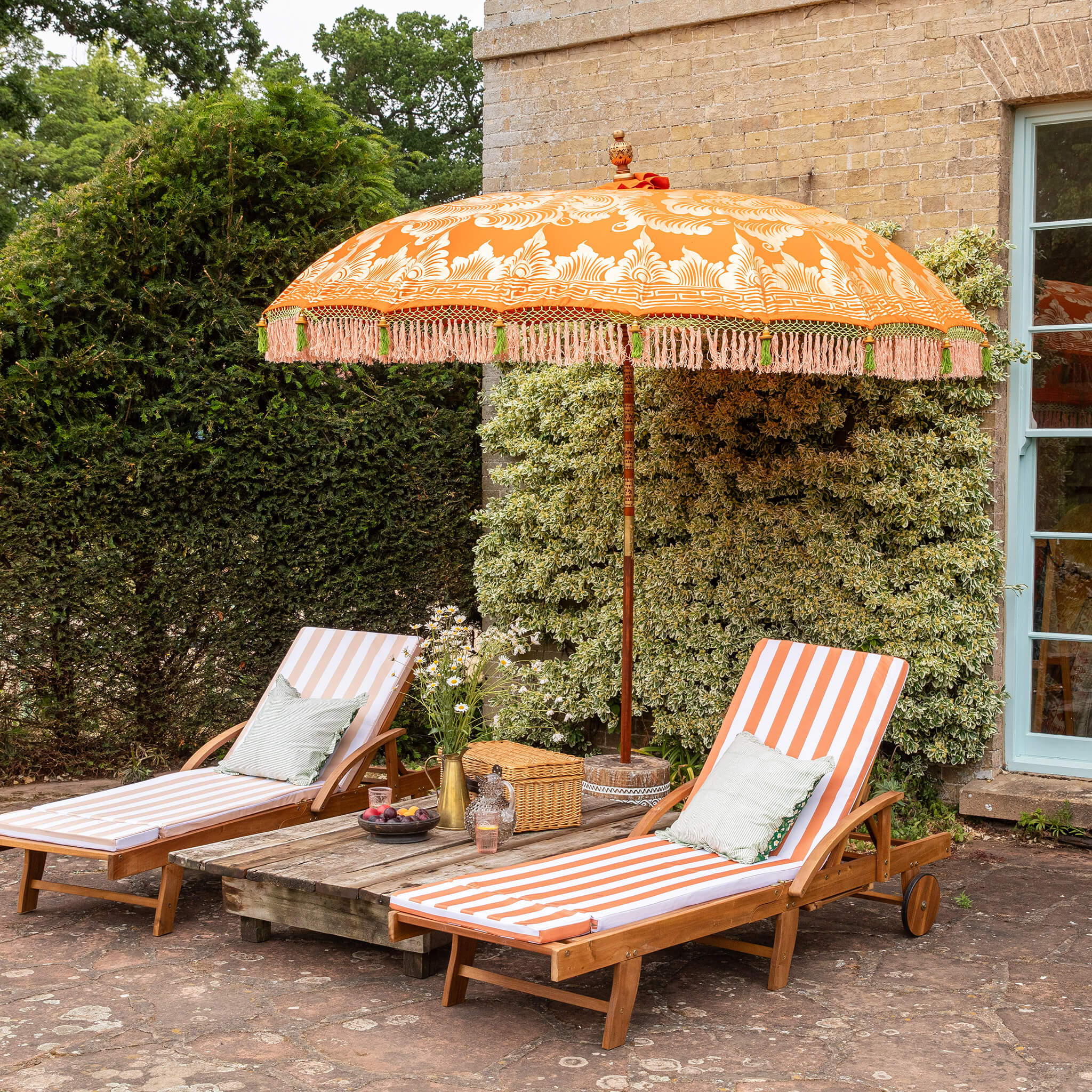
"We recommend styling these parasol with cushions and accessories in rich blues, yellows, greens or oranges. I wanted to inspire people to embrace colour and theatricality. "
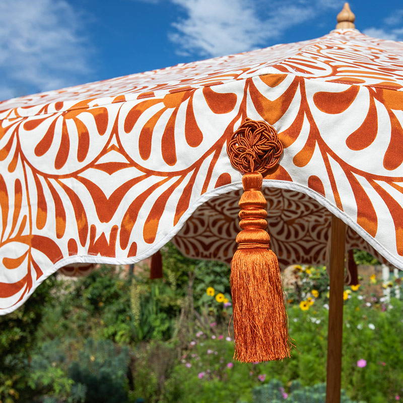
Pinks, oranges, yellow and red tones are the ultimate summer look. A combination of these vibrant shades looks stunning against a garden, pool or patio. They create an enticing scene and are very easy to style together. Don’t be afraid to combine red and pink, this colour pairing opens doors to the additions of muted green, most shades of blue and even burnt orange. We advise choosing one or two warm shades and either a cool colour like blue or green or a neutral like cream or taupe. Terracotta is very elegant and looks beautiful against tonally subdued backdrops with shades of olive, eucalyptus, stone and cream.
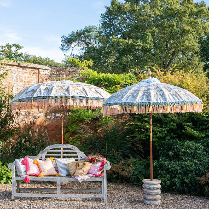
A riot of coloured cushions can anchor and enhance your parasols. If you are creating a look using warm toned parasols, placing patterned and cool coloured accessories underneath looks very inviting.
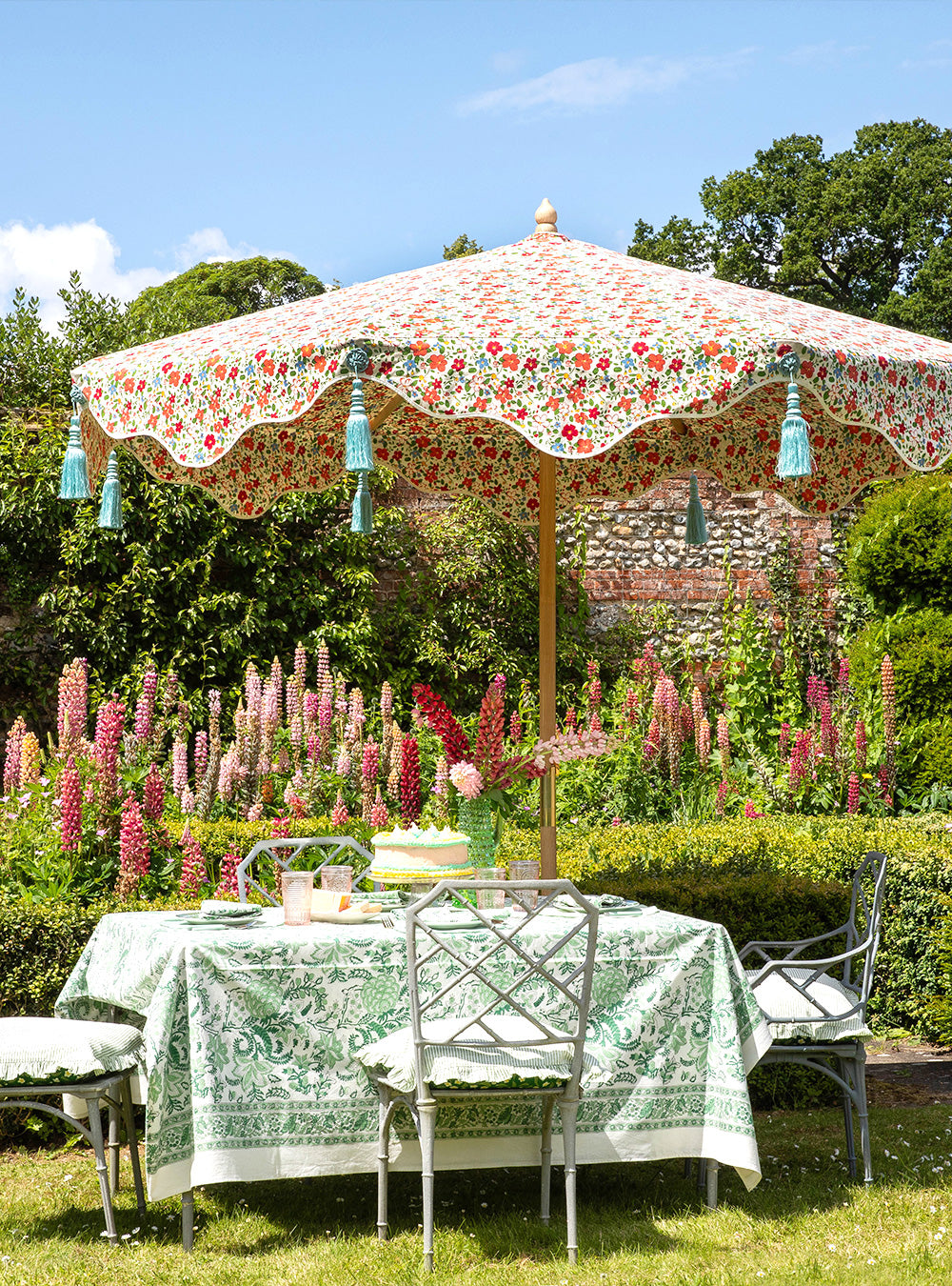
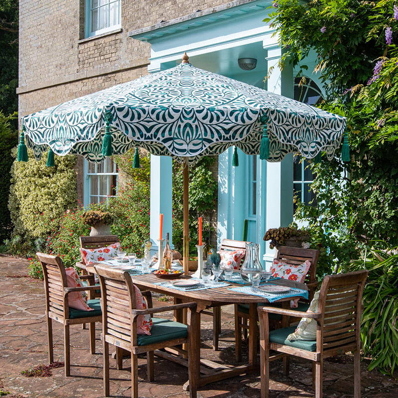
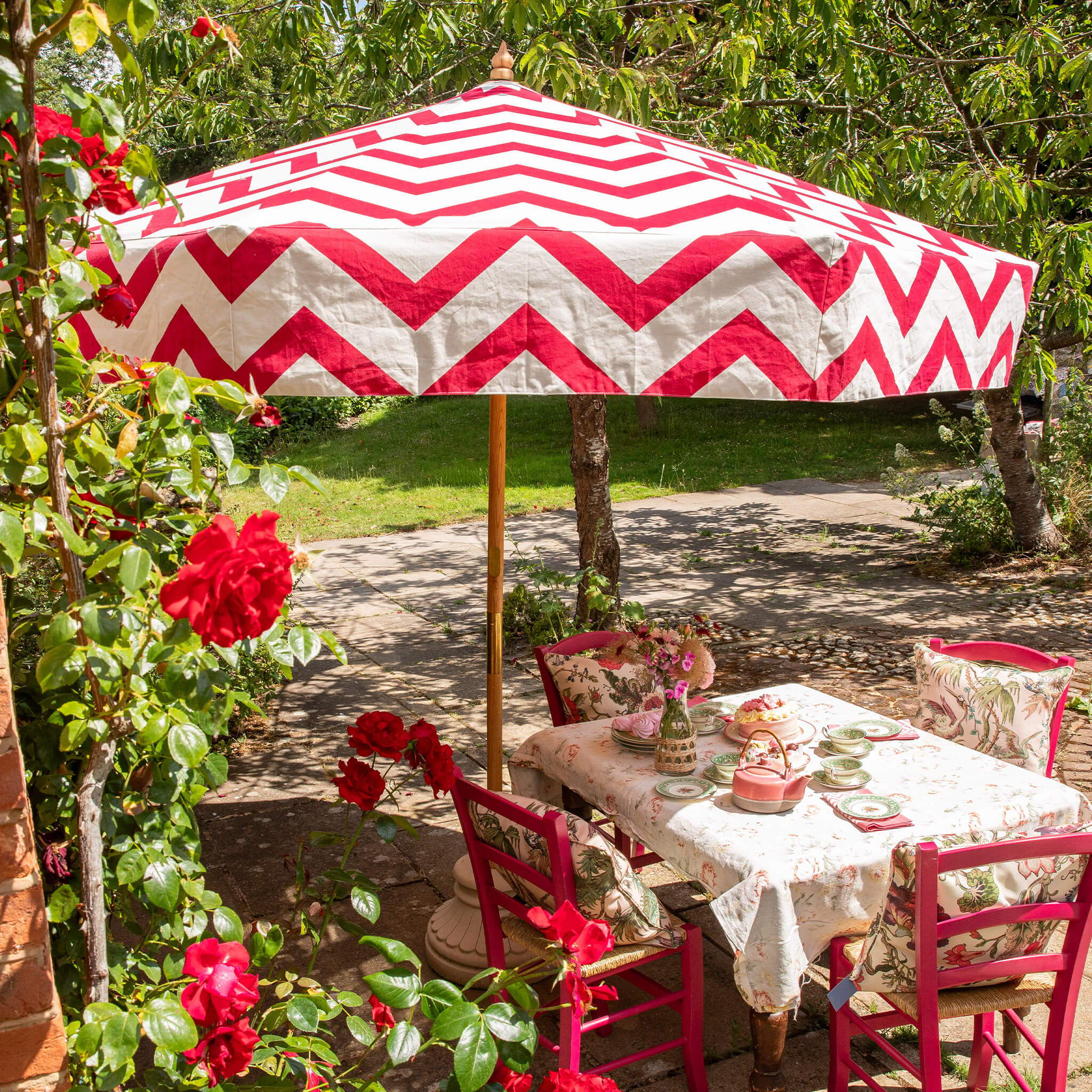
COLOURFUL PRINTS

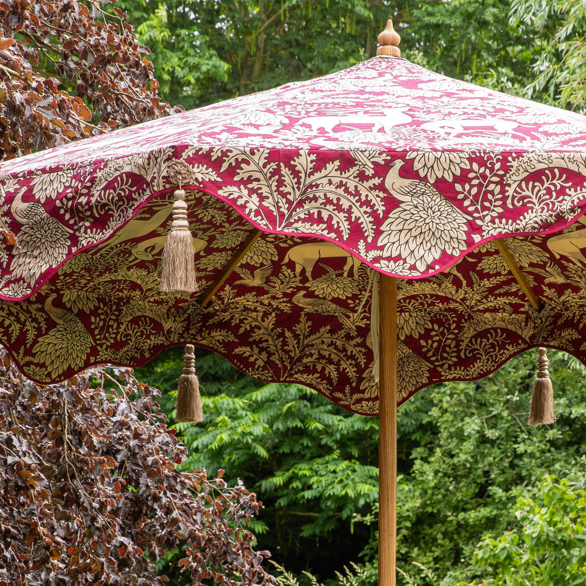
"Prints can be incorporated into different garden styles, from formal to informal, and can adapt to various garden themes, they add visual interest and can enhance the sensory experience of the garden."
Patterns bring a focal point to a scene. They can add colour and texture to complement a busy backdrop like wisteria or brick, and bring eye-catching variety in a plainer space. Prints, whether they’re zig zag, animal or floral, open up styling options. If you’re going for a maximalist look then more is more, we recommend styling your parasol with a variety of patterned cushions and accessories using tonally similar colours.
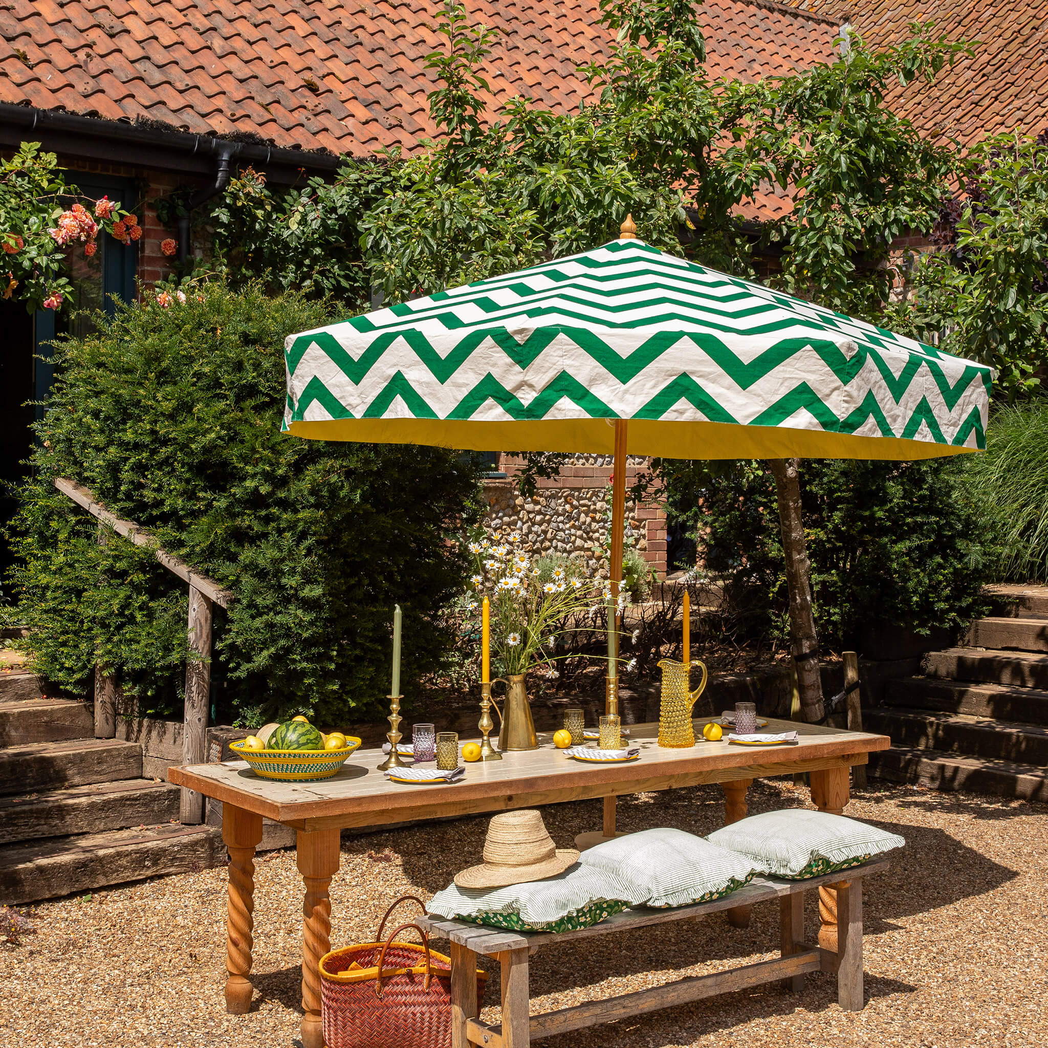
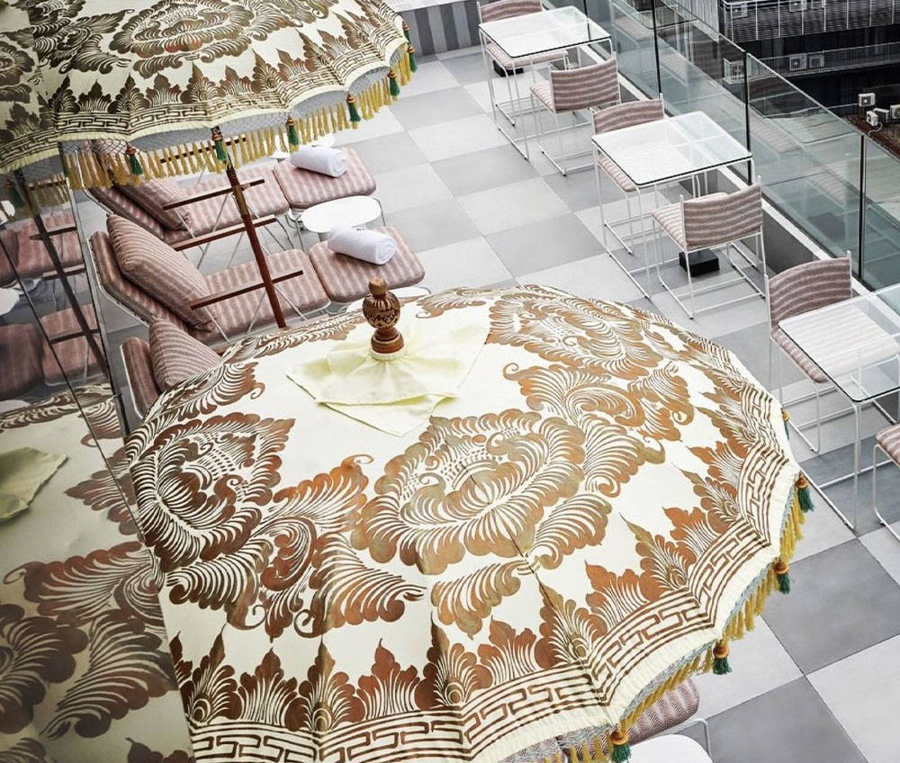
Our new Edmund Octagonal Parasols with racing green and raspberry chevrons have vibes of Tangier in its bohemian heyday with show-stopping zig zags, straight valance and light-yellow coloured lining. This octagonal garden parasol is perfect for an urban garden or a seaside terrace, or against the softness of summer flowers in a country garden.
SHOP EDMUND OCTAGONAL PARASOLS

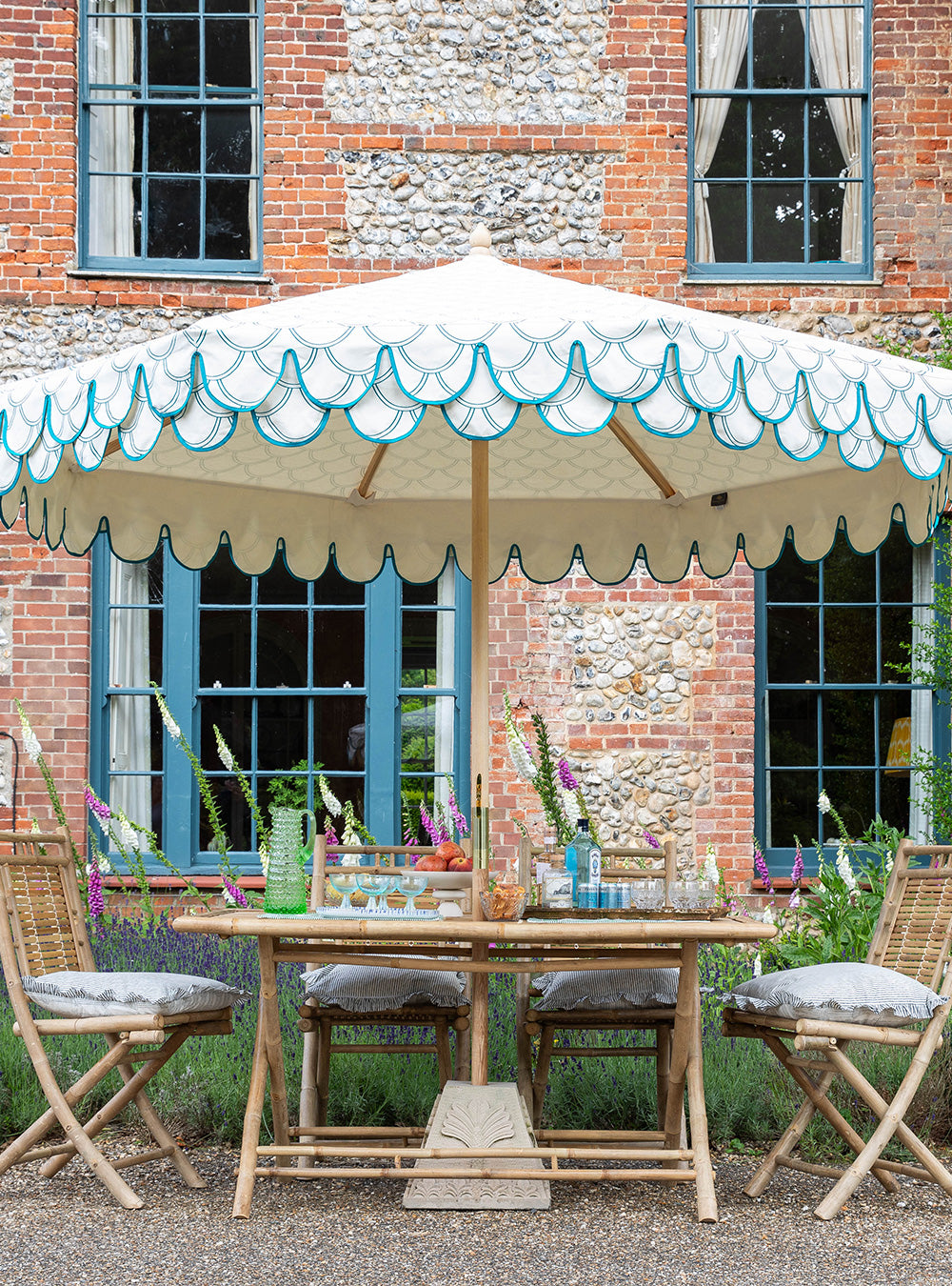
WHITES & NEUTRALS

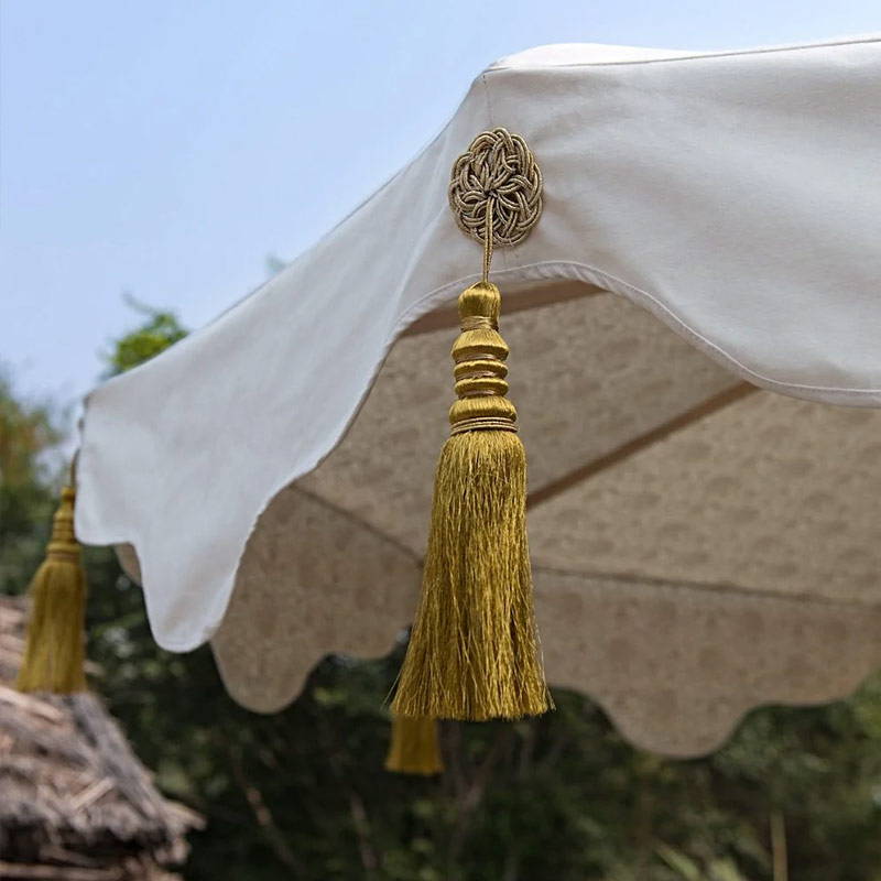
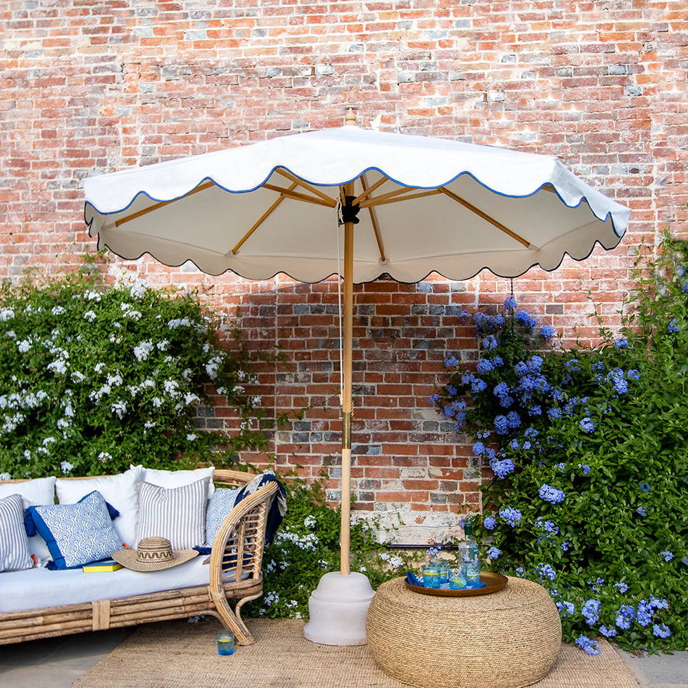

Clean and bright, white parasols conjure an instant feeling of summer. As well as a classic plain white sunshade, we also create parasols with a variety of printed patterns inside the canopy- a hidden secret. Our parasols have beautiful wooden frames and brass fittings which, combined with a white canopy, bring a feeling of luxury and elegance to an outdoor set up. They’re airy and light, perfect against foliage, brickwork, masonry or poolside. A white shade can be styled in any way.
For a classic Hampton’s look we recommend choosing one colour to accessorise with, such as blue, green, red, beige, and one more second colour to break it up. Use white or cream as a base, add cushions in your dominant colour choice, and table accessories in a mixture of the dominant colour and second colour. For a more bohemian style we recommend a riot of colourful cushions, napkins, table accessories, colourful glassware and jars of seasonal flowers from the garden. Pick at least 3 colours, such as pink, lime and yellow- or lilac, yellow and orange- and enjoy seeing how easy it is to add more colour and pattern to these combinations.
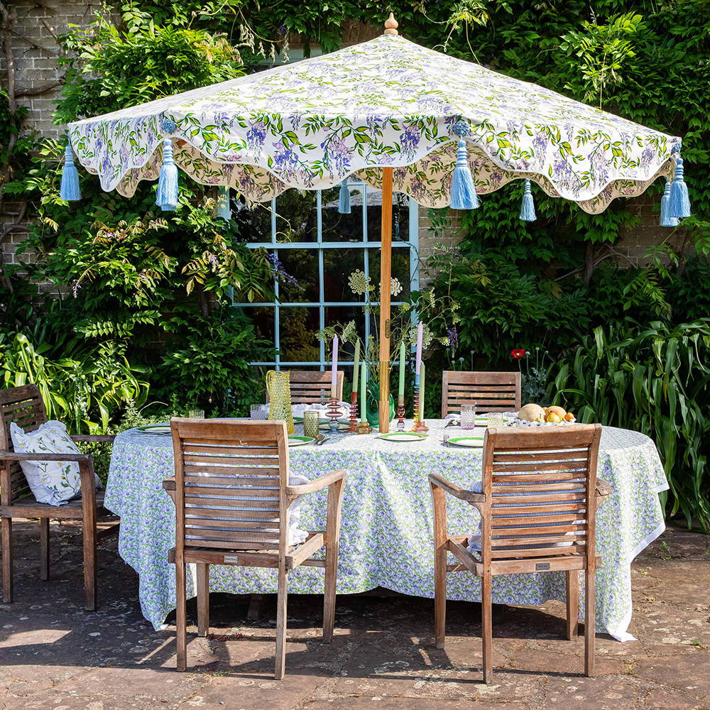
pastel TONES
"Our pastel tones are summery classics - easy to style and timelessly pleasing in a garden, influenced by the 1950’s images of Hollywood high society taken by Slim Aarons and the Harajuku fashion movement in Japan. Pastels pair beautifully with the natural greenery in your garden. They complement the vibrant shades of leaves and help create a harmonious and balanced colour palette"

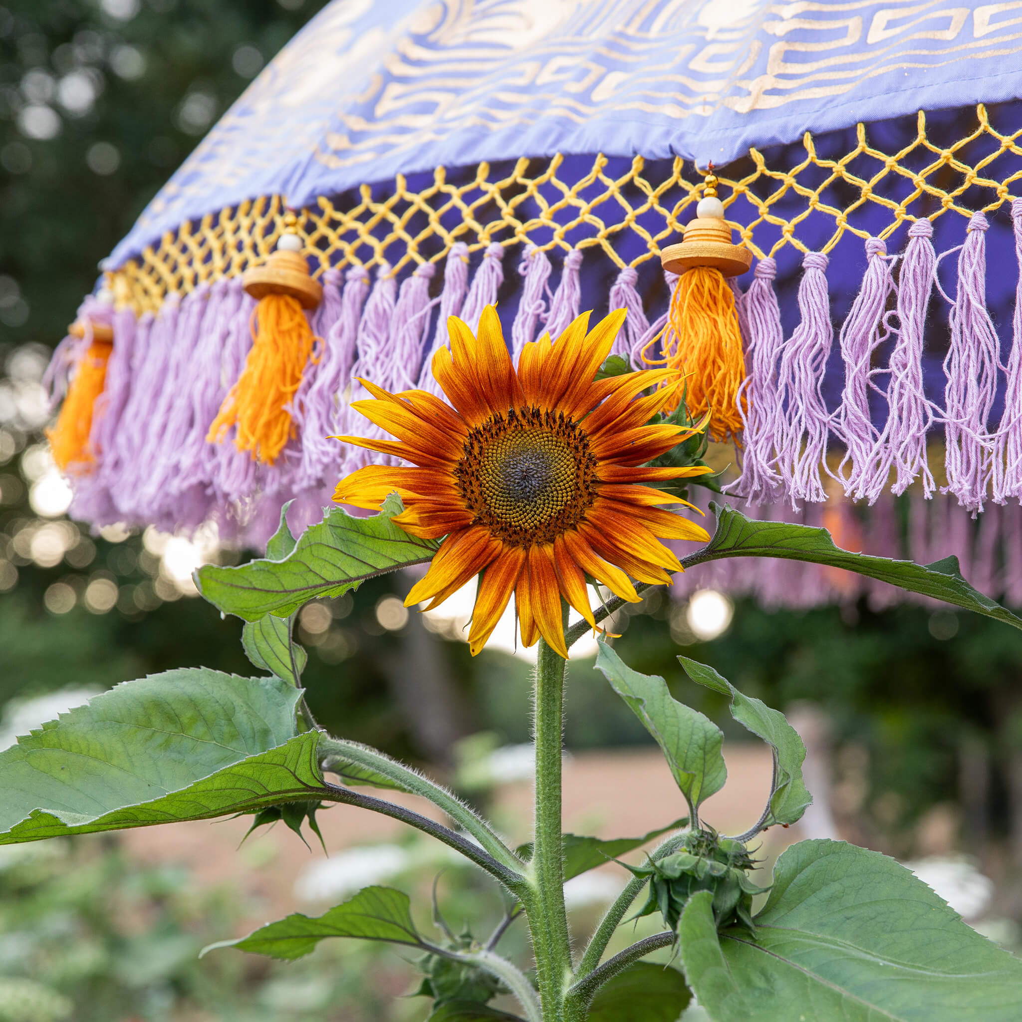
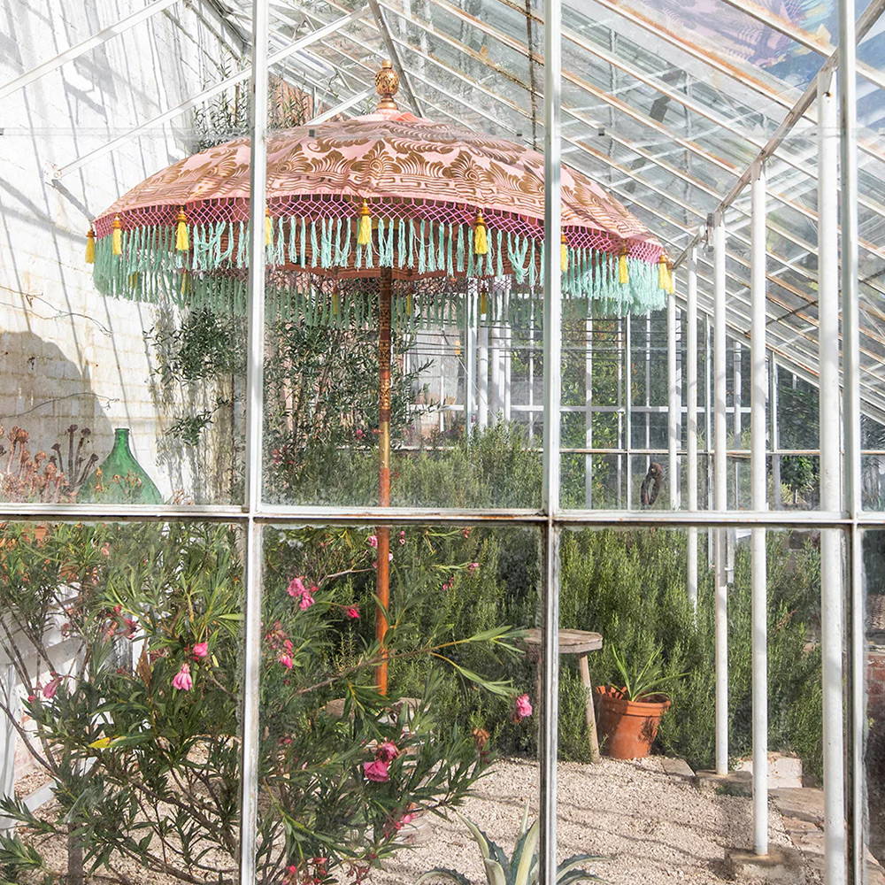
We love pastels, they are magic shades that can make everyone and everything look happy. Blush pinks are subtle and chic, they’re set off by glorious foliage. Pastel blue is a beautiful contrast to the warm colours of summer flowers, and it looks fantastic against wisteria and any climbing plant. The sympathetic pastel colours work with similar tones, can balance out a more vibrant scene, and bring graceful hints of summer to neutral settings. They’re easy to style with cushions and accessories in similar tones, our suzani cushions in yellow, sky blue and coral are designed to complement our pastel parasols.
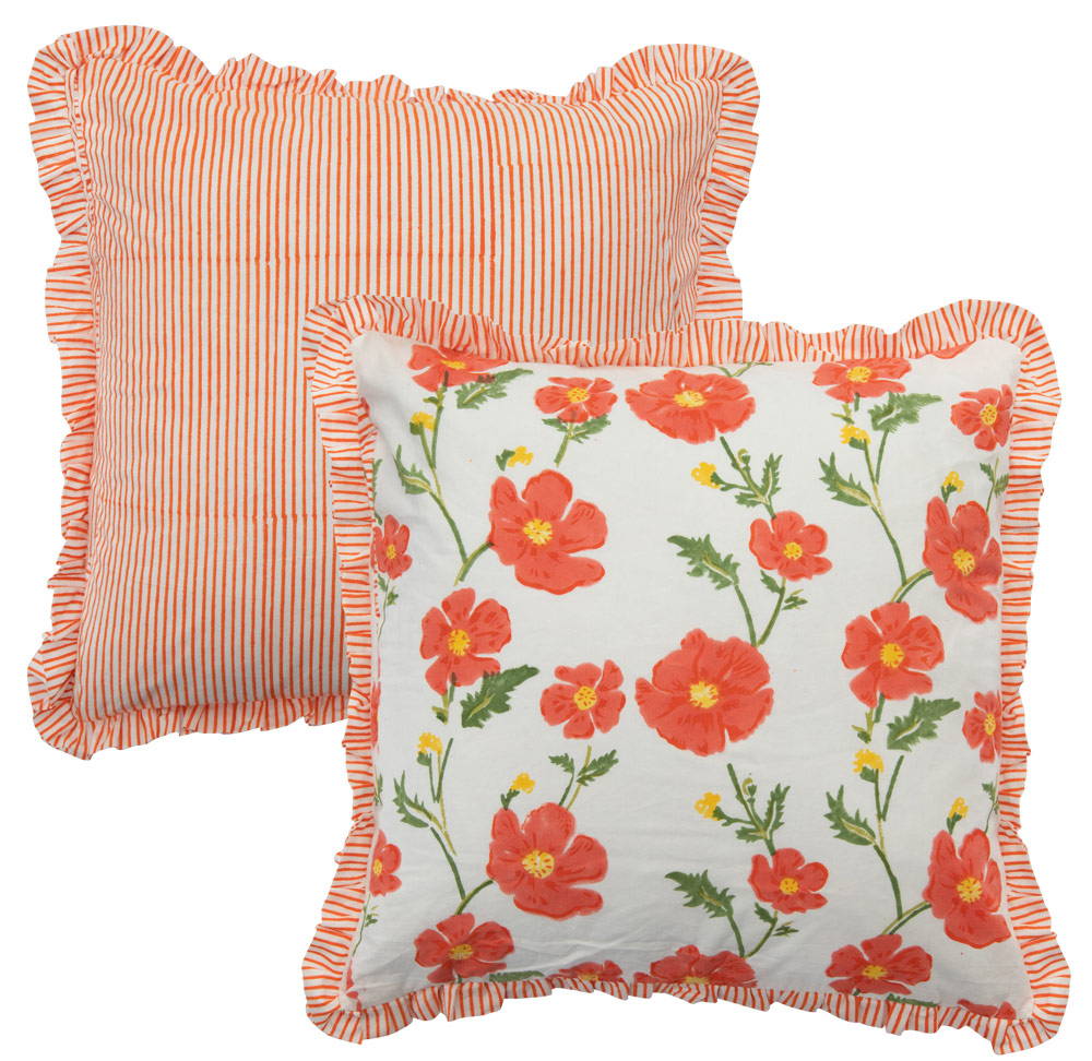
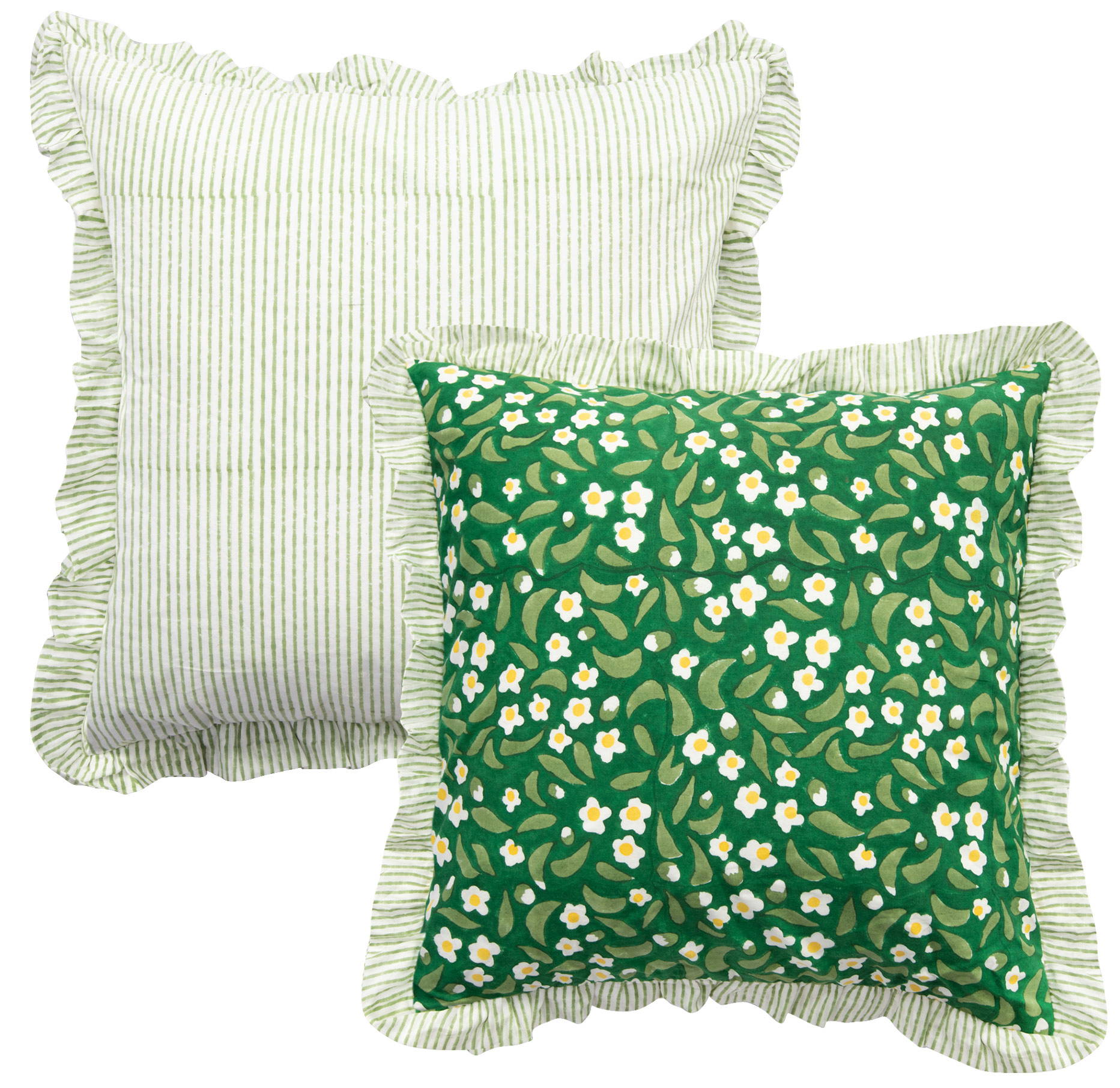
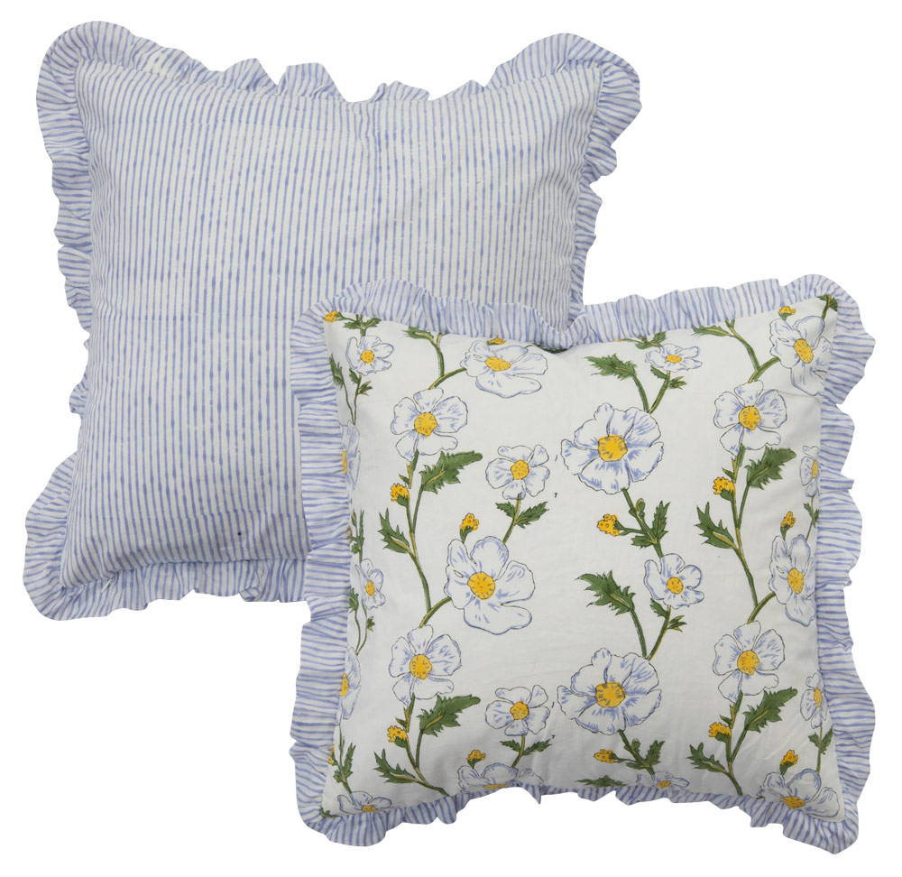
GET CREATIVE WITH CUSHIONS
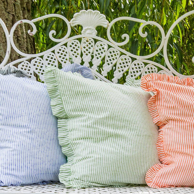
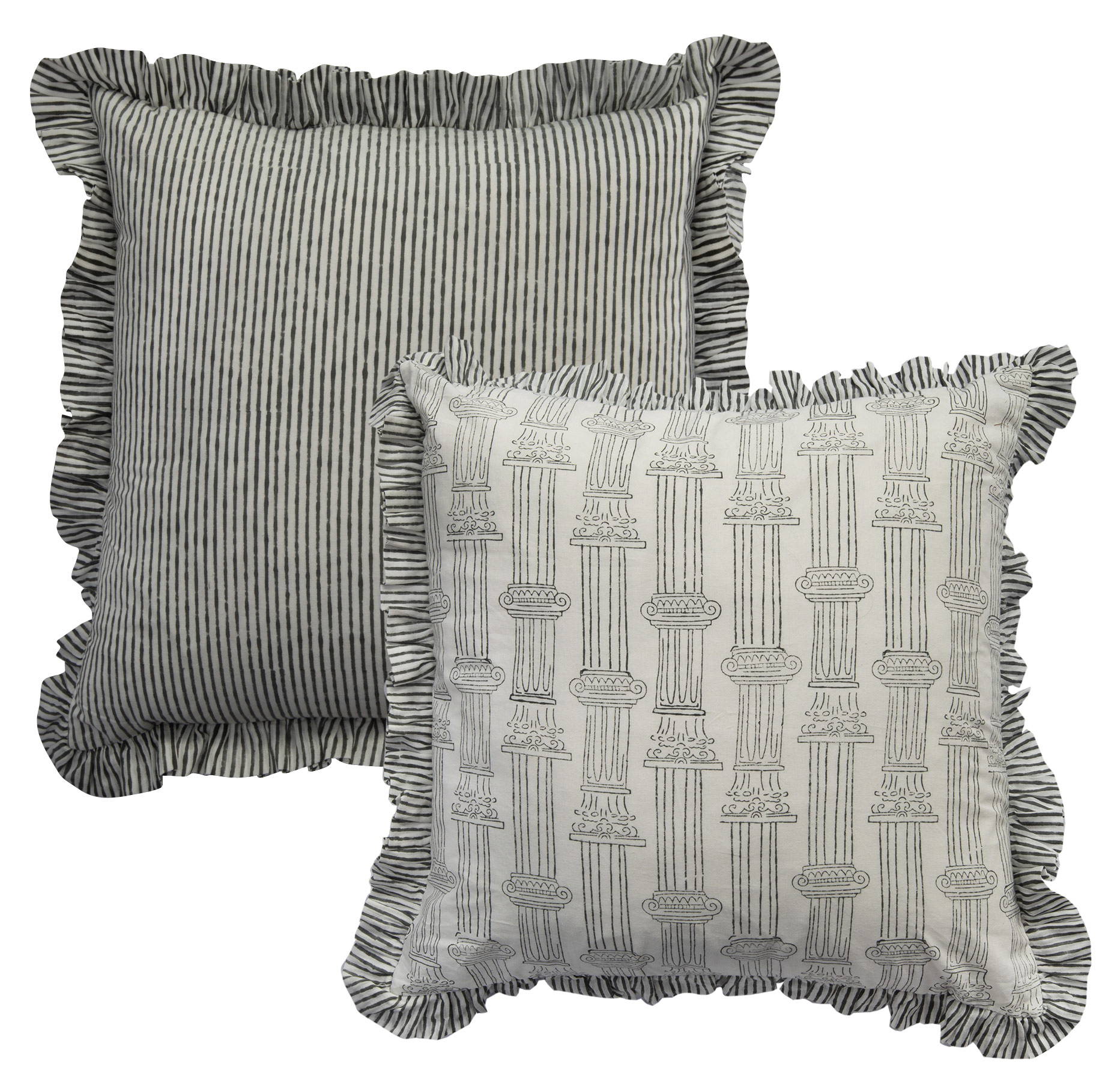
"Create a cottage feel with fine stripes, floral patterns and frilled edges. The cushions are block printed by hand in Jaipur, India on beautiful quality cotton. They have a frilled edge, a pattern on the front and a striped back so you can flip them over to change the look."

SEZANI CUSHIONS
"Our Suzani cushions are hand-block printed on the finest quality cotton. One side has a traditional suzani motif in coral and pink with hints of yellow and sky blue. The other side has a plain coral peacock print and handmade tassels."

JOIN OUR NEWSLETTER & RECEIVE
£10 OFF YOUR FIRST ORDER*
